Columns
Two or more things side by side. A Columns block holds a list of items and lays them out in a grid. An item is a small piece of writing, anything from a sentence to several paragraphs, and it can hold a card, a callout or a picture of its own.
Short paragraphs in two columns:
Lorem ipsum. Dolor sit amet, consectetur adipiscing elit, sed do eiusmod.
Ut enim. Ad minim veniam, quis nostrud exercitation ullamco laboris nisi ut aliquip.
Duis aute. Irure dolor in reprehenderit in voluptate velit.
Excepteur sint. Occaecat cupidatat non proident, sunt in culpa qui officia.
Three cards in a row:
Lorem
Ipsum dolor sit amet, consectetur.
Dolor
Sed do eiusmod tempor incididunt ut labore et dolore.
Amet
Quis nostrud exercitation.
Adding one
Type / at the start of an empty line and pick Columns, or use Add block between two things on the page (Adding a block). Its form opens for you to add the items.
Its options
Point at the block and click Edit on its toolbar to open the form.
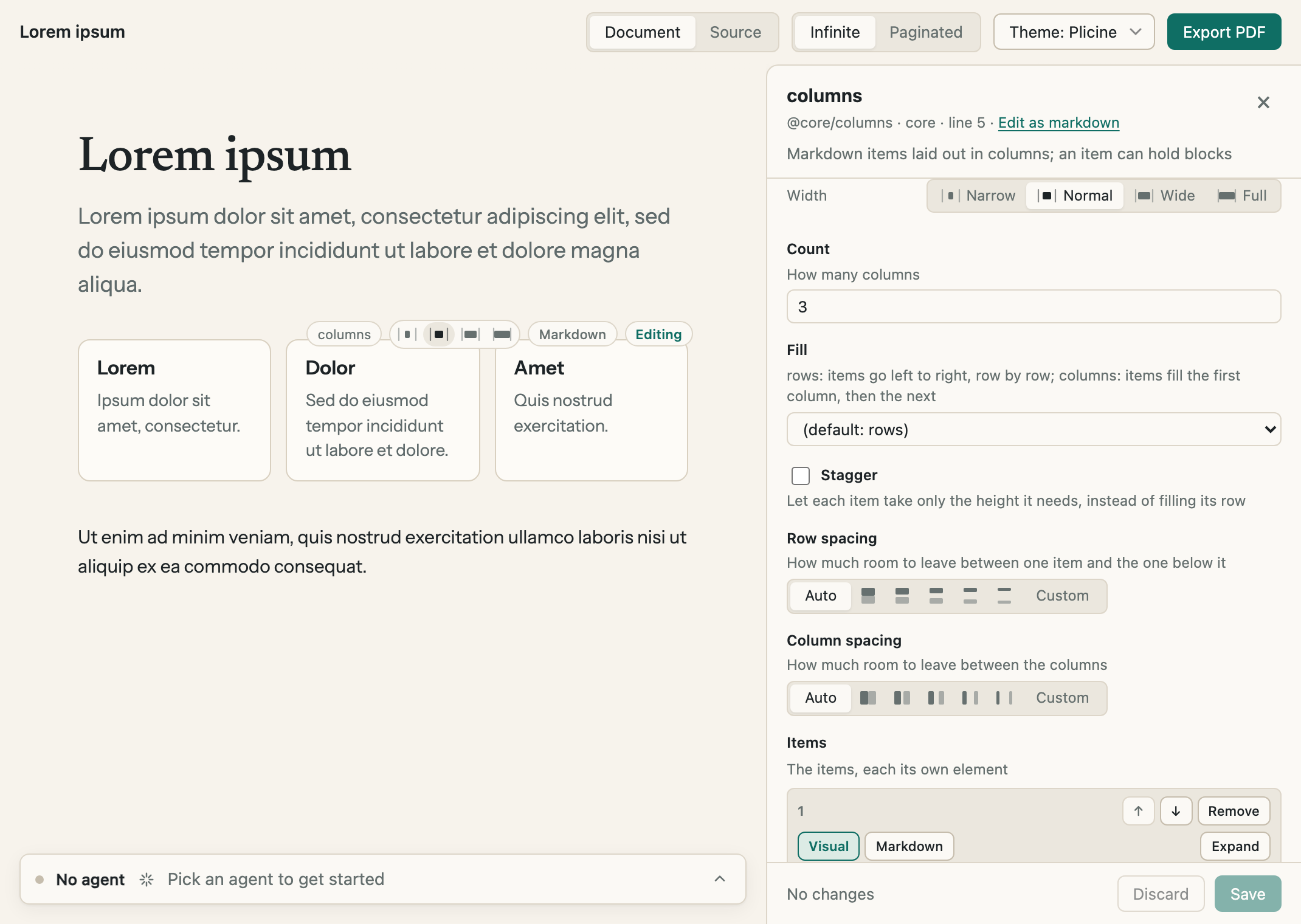
The form for the three cards above. The items are at the foot of the form, each with arrows to move it and a Remove button.
| Option | What it does |
|---|---|
| Count | How many columns, from 1 to 6. It starts at 2 |
| Fill | The order the items go in. rows runs them left to right, then starts the next row. columns fills the first column from top to bottom, then the next, the way a newspaper reads |
| Stagger | See below |
| Row spacing | The room between one item and the one under it |
| Column spacing | The room between the columns |
| Items | The list itself. Add item at the foot adds one, the arrows move one up or down, and Remove takes one out |
| Width | Narrow, Normal, Wide or Full, as for every block. Three columns or more read better at Wide |
Both spacings are a row of buttons. Auto leaves it to your theme. The five pictures of two boxes go from no room at all to a lot: None, Small, Medium, Large and Extra large. Custom takes an exact size for anyone who wants one, such as 12px or 6mm. The page shows the change as you pick.
Changing an item on the page
The form is for adding, moving and removing items. To change what an item says, click it on the page and it opens where it sits, the way a paragraph does. / in there adds a card, a callout or a picture to that item. Emptying an item and saving takes it out of the block.
Rows of equal height, or staggered
With Stagger off, every item in a row is as tall as the tallest one there, so a row of cards lines up along the bottom:
Lorem
Ipsum dolor sit amet.
Dolor
Sed do eiusmod tempor incididunt ut labore et dolore magna aliqua. Ut enim ad minim veniam, quis nostrud exercitation ullamco.
Amet
Quis nostrud exercitation ullamco laboris nisi ut aliquip ex ea commodo consequat. Duis aute irure dolor.
Elit
Excepteur sint occaecat.
With Stagger on, each item is only as tall as what's in it, and sits directly under the one above. The columns end wherever their last item does:
Lorem
Ipsum dolor sit amet.
Amet
Quis nostrud exercitation ullamco laboris nisi ut aliquip ex ea commodo consequat. Duis aute irure dolor.
Dolor
Sed do eiusmod tempor incididunt ut labore et dolore magna aliqua. Ut enim ad minim veniam, quis nostrud exercitation ullamco.
Elit
Excepteur sint occaecat.
What can go in an item
Text, lists, links, pictures, cards, callouts and another Columns block. A table of contents, a list of child pages, a page break and add-on blocks only work at the top level of a page, not inside an item.
In a PDF
The columns print as they look on screen, and an item is never split across two pages.
For technical readers: Core blocks has the block as it's written in the file.